library(ggplot2)Warning: package 'ggplot2' was built under R version 4.3.3df <- read.csv("inf_mortality_ex.csv")Risk ratios are tricky because they are invariant, but odds ratios are not. By using risk ratios, the data can show BOTH gross disparities of infant mortality by race and also show no racial disparities at the same time. The reason comes down to the invariance property.
Odds ratios and risk ratios are both measures used in statistics to compare the likelihood of an event occurring between two groups. However, they have different properties when it comes to interpretation.
Odds ratios are invariant to interpretation: This means that the odds ratio remains consistent regardless of how you frame the event. For example, if you switch the event and the non-event, the odds ratio for the event happening is the same as the odds ratio for the event not happening. This property makes odds ratios particularly useful in case-control studies where the outcome is rare.
Risk ratios are NOT invariant to interpretation: The risk ratio, also known as the relative risk, compares the probability of an event occurring in the exposed group to the probability of it occurring in the non-exposed group. Unlike odds ratios, risk ratios change if you switch the event and the non-event. Therefore, while risk ratios more intuitive, they can result in problematic interpretaions.
library(ggplot2)Warning: package 'ggplot2' was built under R version 4.3.3df <- read.csv("inf_mortality_ex.csv")The interpretation is: in California, there are about 3.04 infant deaths per 1,000. What is going on with Indiana?
(df$inf_mort_white_1000 <- (
  df$white_infant_deaths/df$white_births)*1000
 )
[1] 3.047175 3.522871 2.247074 6.016995 3.653389 5.047984 5.131467 4.275928knitr::kable(
df[, c(1,8)],
col.names = c(
'State',
'White Infant Mortality per 1,000'
),
align = "lc"
)| State | White Infant Mortality per 1,000 |
|---|---|
| California | 3.047175 |
| Colorado | 3.522871 |
| Connecticut | 2.247074 |
| Indiana | 6.016995 |
| Maryland | 3.653389 |
| Michigan | 5.047984 |
| Ohio | 5.131467 |
| Pennsylvania | 4.275928 |
The infant mortality rate for Black infants is substantially higher. In Michigan, there are 14.2 Black infants who die for every 1,000 births.
(df$inf_mort_black_1000 <- (
  df$black_infant_deaths/df$black_births)*1000
 )
[1] 9.066566 11.713521 8.951113 11.710539 9.584821 14.162292 13.206092
[8] 10.747552knitr::kable(
df[, c(1,9)],
col.names = c(
'State',
'Black Infant Mortality per 1,000'
),
align = "lc"
)| State | Black Infant Mortality per 1,000 |
|---|---|
| California | 9.066566 |
| Colorado | 11.713521 |
| Connecticut | 8.951113 |
| Indiana | 11.710539 |
| Maryland | 9.584821 |
| Michigan | 14.162292 |
| Ohio | 13.206092 |
| Pennsylvania | 10.747552 |
Below, I calculate the relative risk ratio for Black infants compared to Whites. You can see very large disparities. For example, in California the relative risk of death for Black infants is almost three times higher than for White infants (2.975)
(df$RR_mort_black_white <-
   df$inf_mort_black_1000/df$inf_mort_white_1000)
[1] 2.975401 3.324993 3.983454 1.946244 2.623542 2.805535 2.573551 2.513502Let’s calculate the survivorship ratio
df$inf_surv_white <-
  df$white_births - df$white_infant_deaths
df$inf_surv_black  <-
   df$black_births - df$black_infant_deaths

df$inf_surv_white_1000 <-
    (df$white_births/df$inf_surv_white)*1000
df$inf_surv_black_1000 <-
(df$black_births/df$inf_surv_black)*1000(df$RR_surv_black_white <-
df$inf_surv_black_1000/df$inf_surv_white_1000)[1] 1.006074 1.008288 1.006765 1.005761 1.005989 1.009245 1.008183 1.006542ggplot(
df,
aes(x = as.factor(Location),
y = RR_mort_black_white,
group = 1)
) +
geom_line() +
ylim(0, 4) +
labs(
title = "Relative Risk of Infant Mortality: Black - White",
x = "Location",
y = "Relative Risk"
) +
theme_minimal()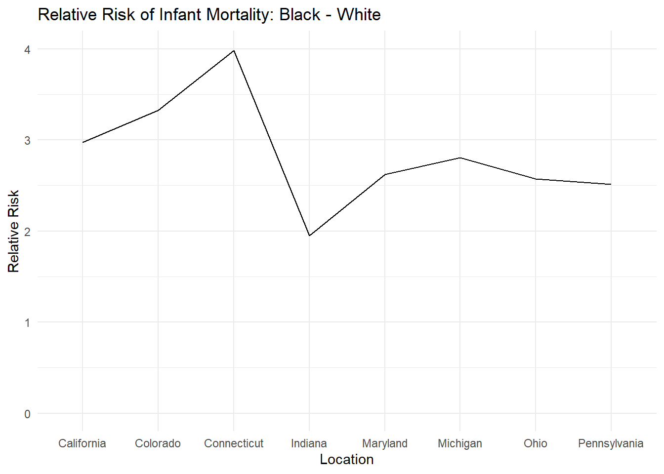
ggplot(
  df,
  aes(x = as.factor(Location),
      y = RR_surv_black_white,
      group = 1)
) +
  geom_line() +
  ylim(0, 1.1) +
  labs(
    title = "Relative Risk of Infant Survival: Black - White",
    x = "Location",
    y = "Relative Risk"
  ) +
  theme_minimal()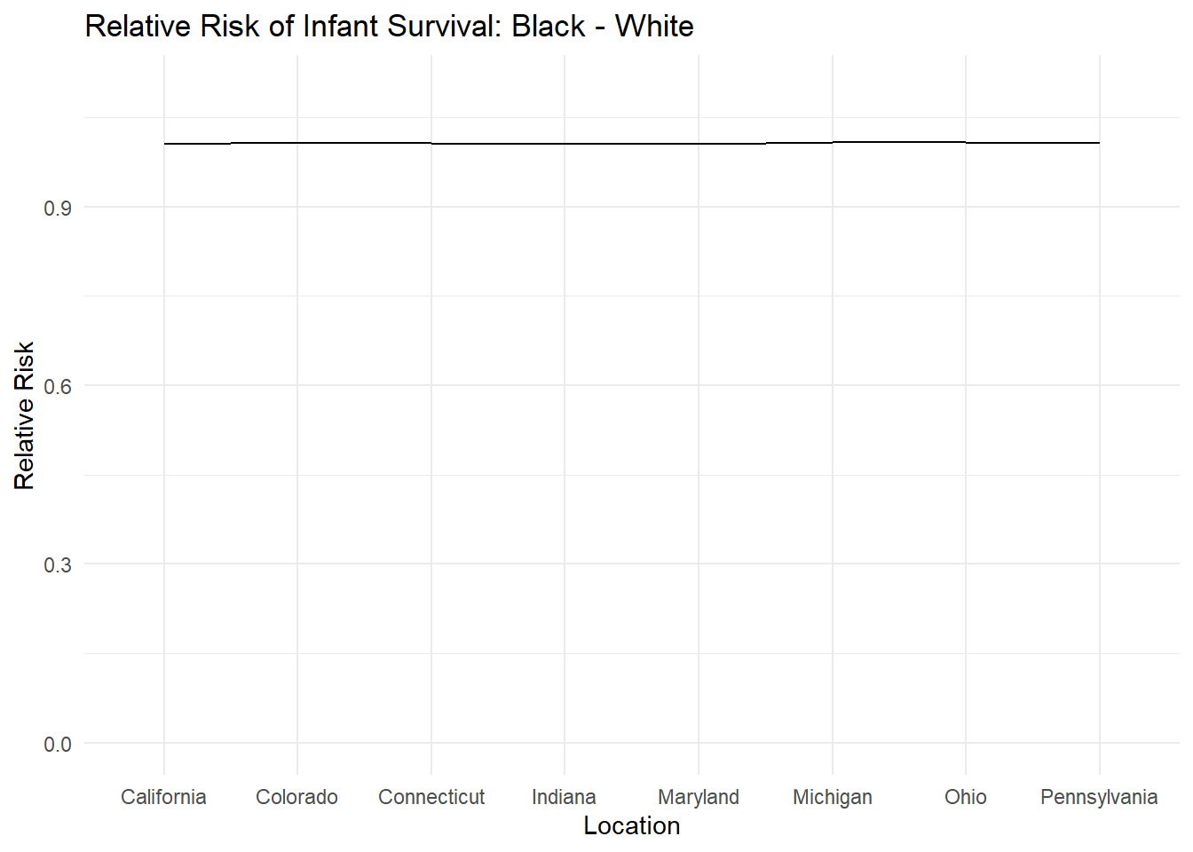
We can make nicer charts with the add-on package called ggthemes. Let’s install it and see if we can make prettier charts. install.packages(ggthemes) then library(ggthemes)
Below, I am selecting the theme called theme_stata which makes the output look like a stata graph.
library(ggthemes)Warning: package 'ggthemes' was built under R version 4.3.3ggplot(df,
aes(x=as.factor(Location),
y=RR_surv_black_white, group=1)) +
geom_line(color = "midnightblue") +
ylim(0, 1.1) +
theme_stata() +
labs(title = "Black-White Survivorship", x = "Location", y = "Relative Risk")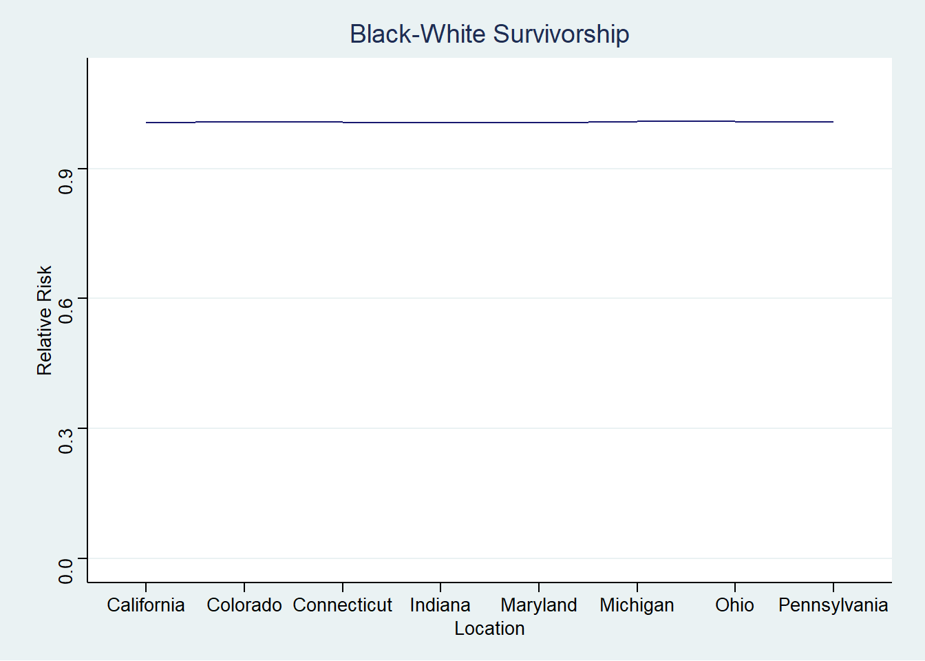
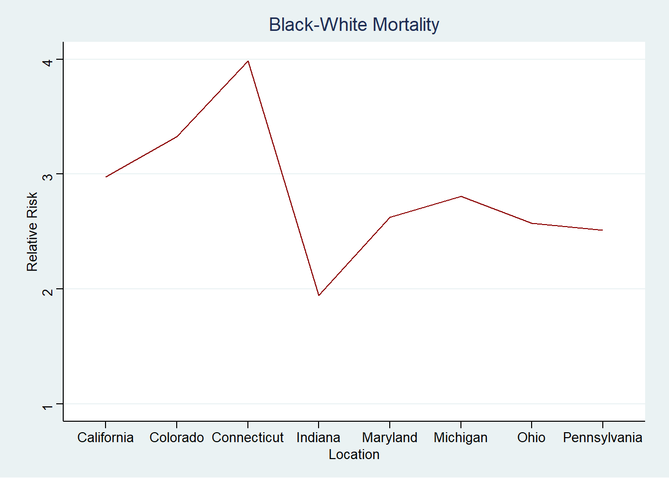
ggplot(df,
  aes(x=as.factor(Location),
  y=RR_mort_black_white, group=1))  +
  geom_line(color = "darkred") +
  ylim(1, 4) +
  theme_stata() +
  labs(
    title = "Black-White Mortality",
    x = "Location",
    y = "Relative Risk"
    )
It is very reasonable to examine these data further.