Morning
🔑Key Takeaways for Day 3
Describing and Visualizing Data
It's getting real! Today we will start analyzing the data we downloaded and cleaned in Days 1 & 2. The goal is not to learn/review inferential statistics. The goal for this section is to demonstrate how to be effective at describing your data -- which is the first step of all analyses -- Know thy data. Therefore, we learn how to present what should always be (imho) the first two tables in any publication -- the table of descriptive statistics (i.e., Table 1) and some representation of the relationships in your data (Table 2, Figure 1, etc.)
First, let's get a sense of the type of visualizations that are offered in jamovi and JASP. Whereas SPSS graphics have much improved over the past decade, they are still really poor in comparison. So, I will make a chart or two in SPSS so you know how it is done, but we will focus on the other software for visualization.
Note on Integrating R and JASP
Learning R in JASP
-
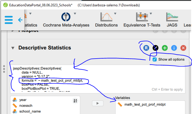
You can become familiar with R coding through the JASP interface. We don't have time in this bootcamp to go through many examples of this, but I show you how to get JASP to show you the R syntax it is using to run the analysis you did in JASP.
-
If you click the R symbol
 in the JASP editor as shown below the syntax for the code you ran is shown in the analysis tab
-
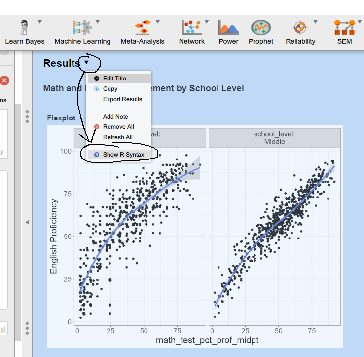
You can also display all of the code for all of the analyses you have run by scrolling to the very top of the output in the main Results tab and selecting 'Show R Syntax' (see below)
-
This video has a great explanation of the R console in JASP, if you want to learn take a look!
📃 Summary of Notes
The type of visualization you choose depends on the type of data you have. For example, to make a frequency distribution you need categorical data. If you have continuous data – the appropriate visualization is a distribution plot with density. A major benefit using jamovi and JASP is that neither will allow you to run analyses with the wrong data type, and so they both offer good ways to learn about data.
Making charts in Microsoft Excel
Temporal heat maps
Data collected over time is called longitudinal data
- Examples
- Intervention studies in which individuals may be interviewed at two different points in time
- Official crime rates per 100,000 (i.e., UCR) for each year
- Data are aggregated along two different time intervals
- Examples
- Month and day
- Year and Month
- Day and Hour
- Note: you must know how to work with dates in excel from Day 2
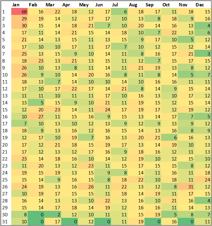
- Here is a temporal map I made using crime data from DataLA: Information, Insights, and Analysis from the City of Angels | Los Angeles - Open Data Portal (lacity.org)
- You notice that New Year's day and Thanksgiving Day, and New Year's Eve may be times when people are particularly likely to be victimized.
- Examples
❓ Your turn: Make a Heatmap and Time Series Plot in Excel
- Download the LA city crime data for 2020 onwards and filter the data to return all cases of IPV (you can choose simple or aggravated or both)
- Use the date field to extract the month, day and year
- Use Pivot tables to sum the number of IPV crimes by (1) day and month; and (2) year
- Make a heatmap of day and month as shown above -- what do you observe?
- Make a time series map of IPV crimes by year (beginning from 2020 - present) -- what do you observe?
Visualizing data in jamovi and JASP
Frequency Distributions
Histograms
- Open the file called "NSCH_2021_sub_final.JASP"
- This file contains information on ACEs, school and neighborhood safety, demographics and concussions from the National Survey of Child Health
- Let's make a frequency table of ACEs
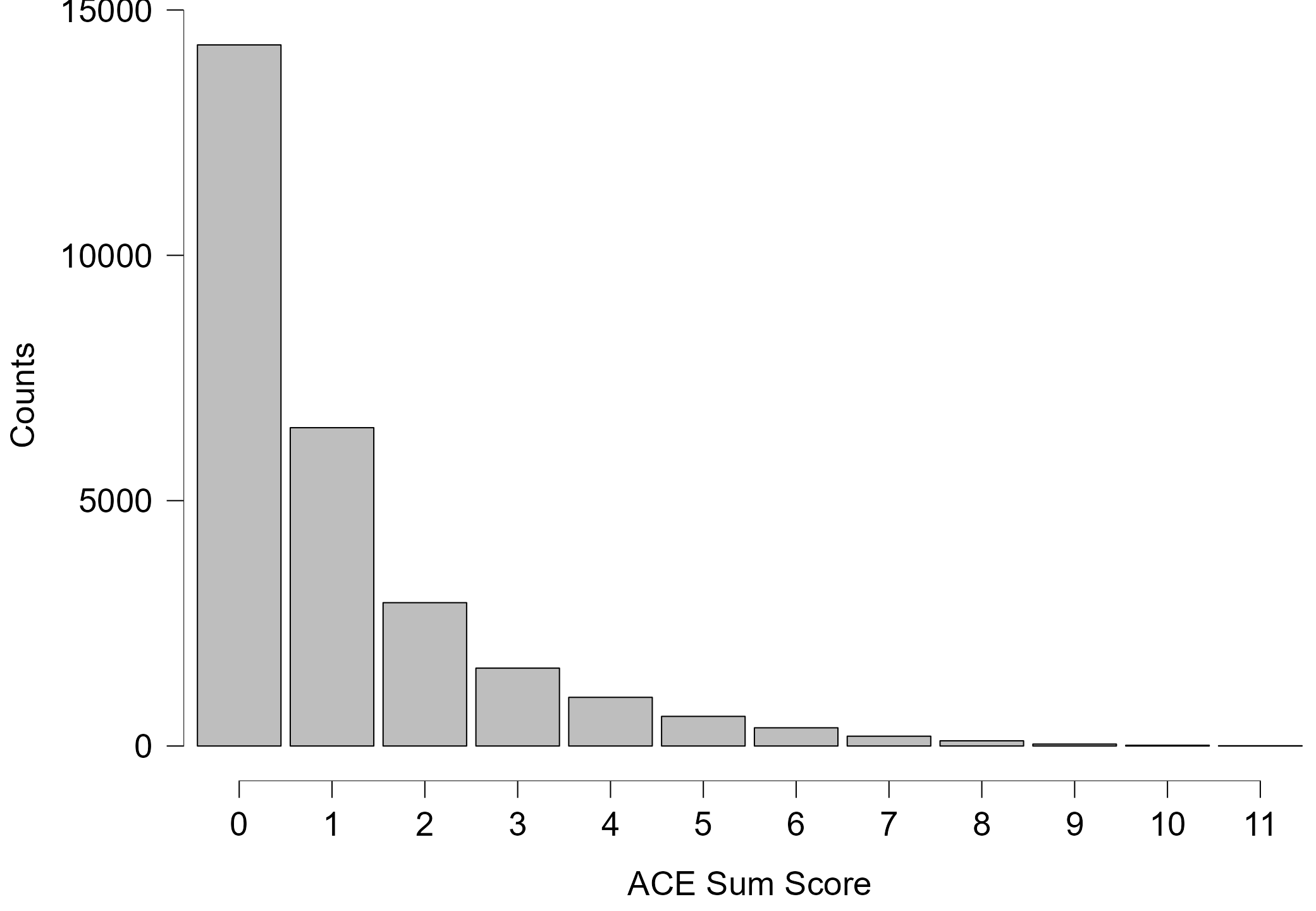
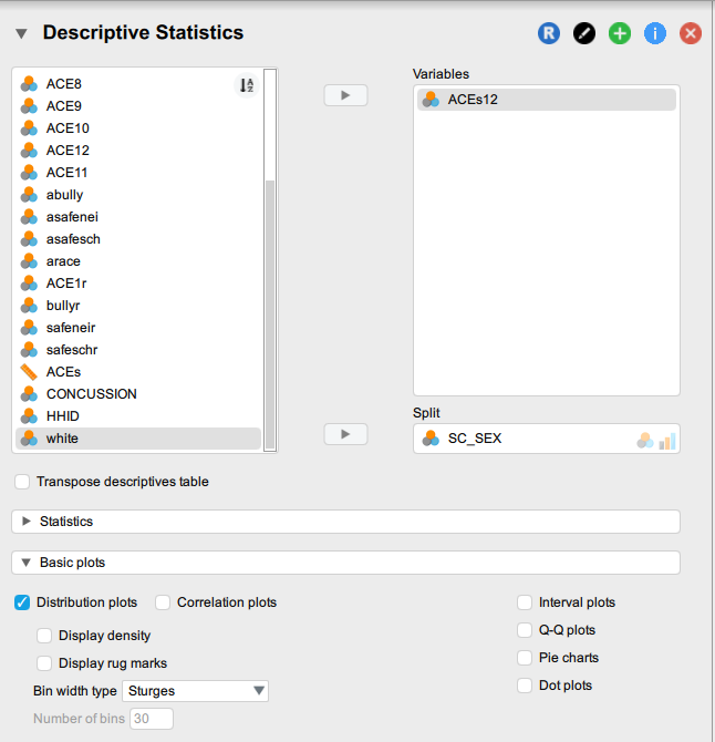
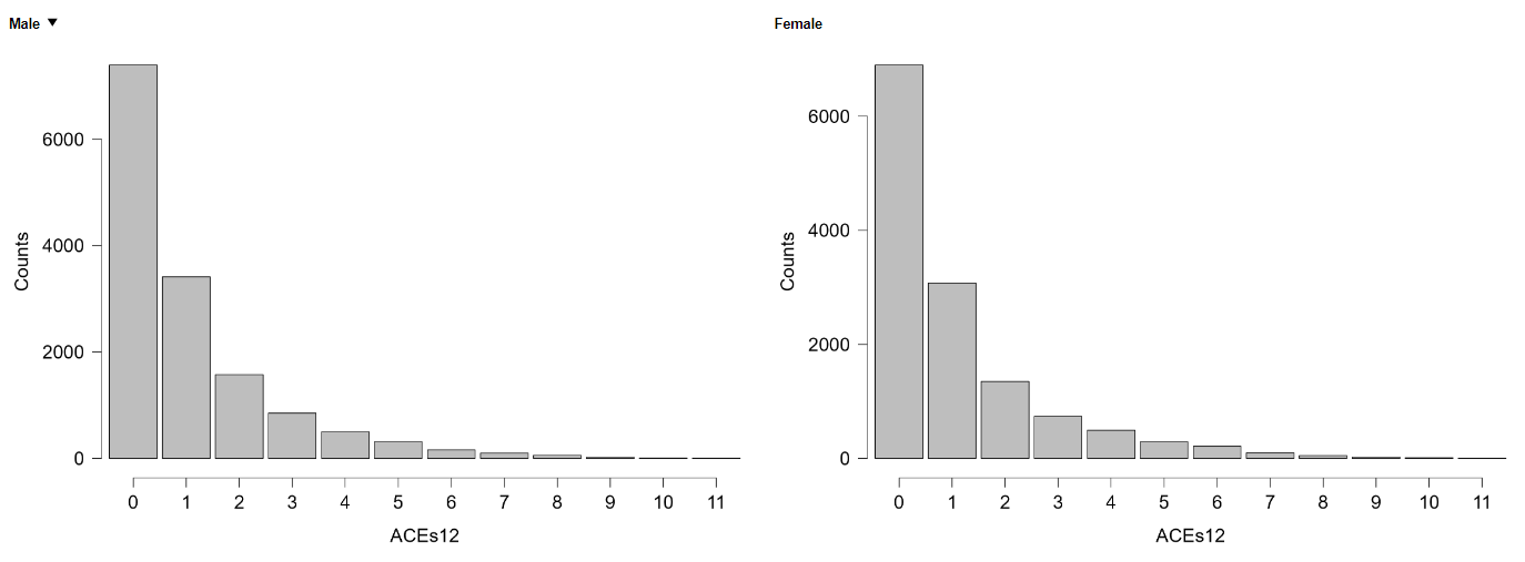
- Let's split the data by Biological Sex
Univariate and bivariate bar charts & histograms
❓ Your turn
- Identify the variable achage, this is the age of the child
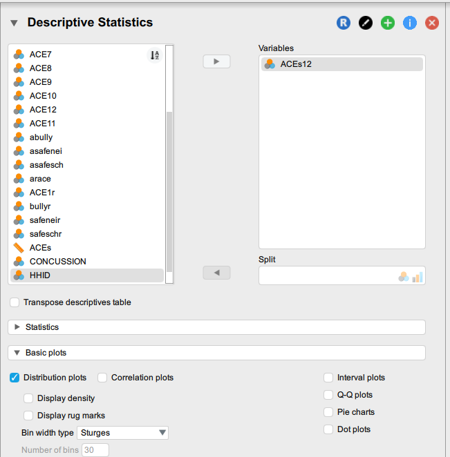
- Click on the Button that says ‘Descriptives.’ Move the variable ‘achage’ into the box titled ’Variables’
- Make a distribution plot of age
- Change the range of the x-axis to go from 0 to 18 (why?)
- Split the age distribution plot by the variable 'CONCUSSION' -- what do you observe?
- Make a box plot of achage
- Make sure the boxplots ‘box’ is checked
- Click on ‘box plot element’, ’Jitter element’ and ‘Label outliers’
- Make a box plot of achage by CONCUSSION and play around with the formatting until you see something that looks like this:
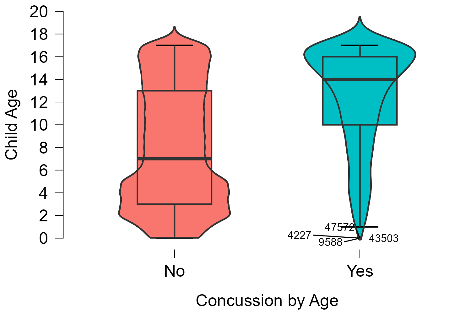
- From the plot above, does it look like age is statistically different for children who have had a concussion?
- Let’s make the frequency table of age by concussion and ACEs by biological sex
Other Types of Visualizations
- In JASP the Descriptives tab offers several other options (note: you need to know data variable types!)
- Likert plots
- Scatter plots
- These are the most basic plots that we can make using jamovi. Navigate to Bootcamp/ex/Exploration and open the files in this order:
- BarPlots.omv
- Box Plots.omv
- DensityPlots.omv
- DotPlots.omv
- ViolinPlots.omv
Day 3 Afternoon
Describing data: Tables & Advanced Visualization
By adding the additional modules, we have more functionality. The two best visualizations are found in jjstatsplot and flexplot. Let's explore the functionality of these modules using the dataset BigFiveInventory.csv. This data contains 6 variables, the Big Five Personality Traits (Extraversion, Openness, Conscientiousness, Neuroticism, and Agreeableness) & Gender.
Descriptive Statistics
Describing the variables (Table 1)
-
From the file menu click 'Analyses' and then 'Exploration' --> 'Descriptives'.
-
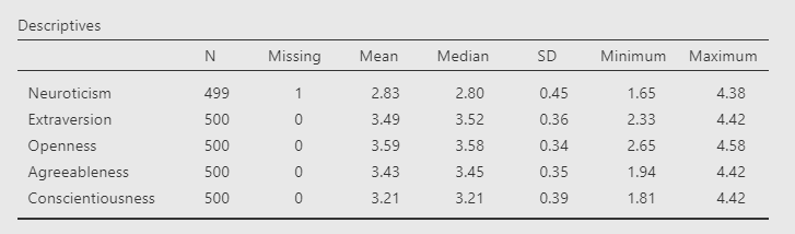
Get a descriptive summary of each variable
-
You will see the following output
-
Using jamovi (and JASP) to display APA formatted results Notice that unlike SPSS, the table is already APA formatted.
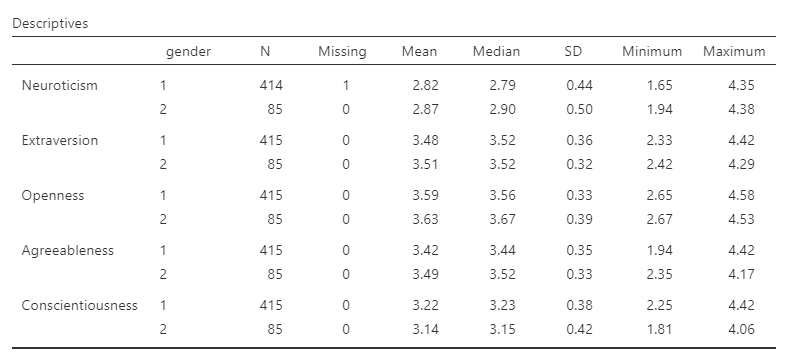
- Get a descriptive summary of each variable by Gender
- place the Gender variable in the 'Split by' column
Exporting tables to Word, pptx and excel
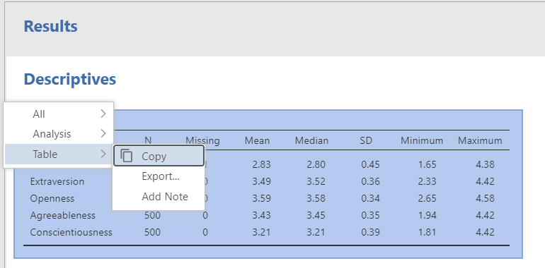
- All you need to do is click on the table --> right click --> and select 'Table' --> and 'Copy.' You can then paste the table into a word document.
Innovative data visualization tools
I just submitted this poster to the International Summit on Violence, Trauma and Abuse: Associations Between Non-suicidal Self-harm and Adverse Childhood Experiences among Cis- and Trans- gender Adults I relied heavily on the visualizations shown below.
The next few examples use data from Bootcamp/ex/Exploration/Big Five Personality Traits.omv
-
Histograms
- The add-on module 'esci' has some cool visualization tools including for histogram and dot plots. We installed this Day 1
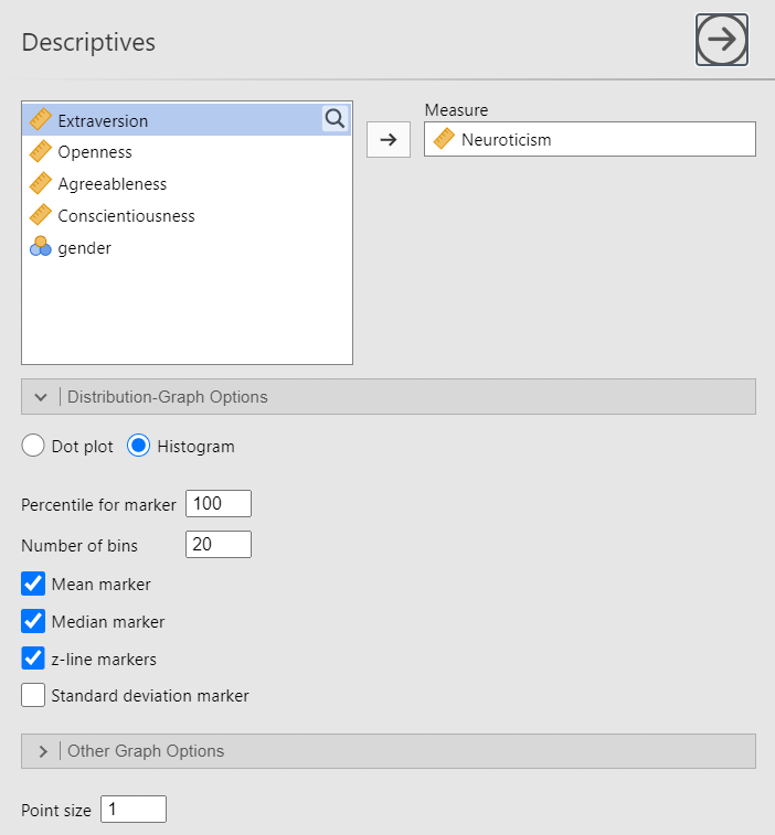
- Under Analysis click "esci" and then "Descriptives"
- In the Measure text box move the variable "Neuroticism"
- In the 'Distribution-Graph Options' click Histogram and then make sure the following options are specified
-
You should get the following chart
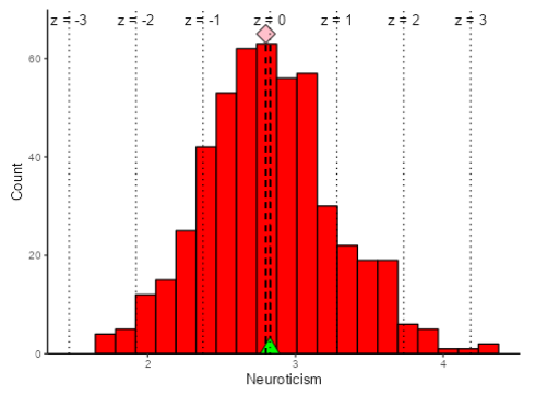
❓ Your turn: Recreate the plot with a different legend for gender
- Change the "Percentile for marker" value from 100 to 50. What happens?
- Change the "Percentile for marker" value from 100 to 20. What happens?
- Scatterplots
- In jamovi, from the file menu click Analyses --> Exploration --> Scatterplots
- put Neuroticism in the x-variable, and Extraversion in the y-variable
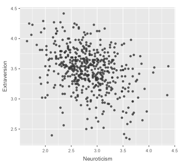
- Make it fancy!
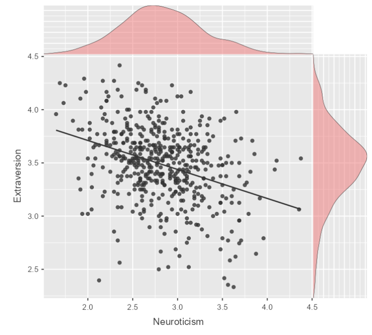
- What is different about this chart?
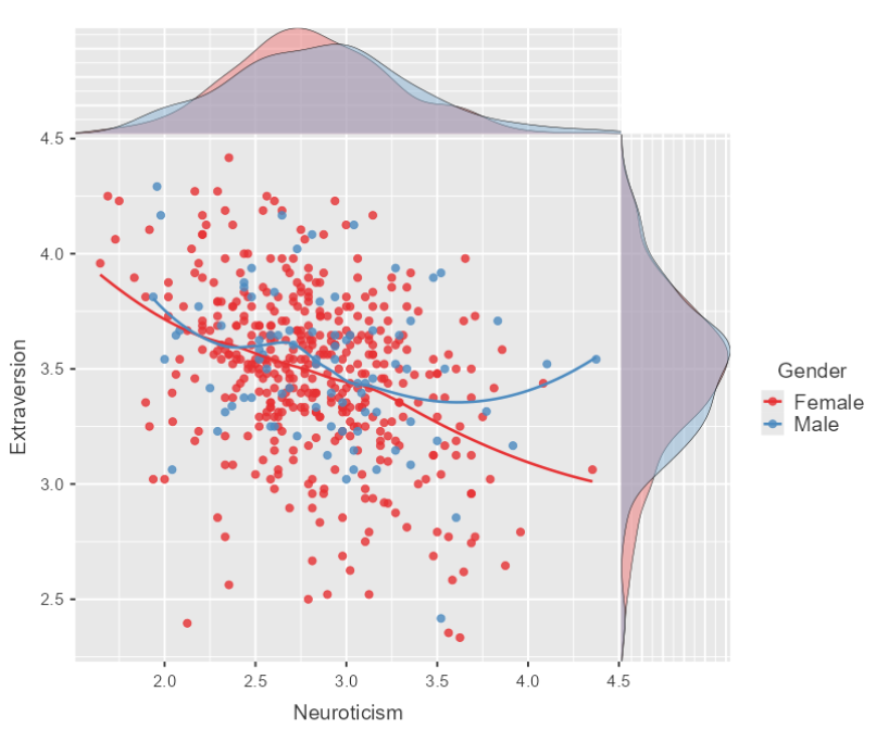
Even fancier! Make this multivariate and include gender!
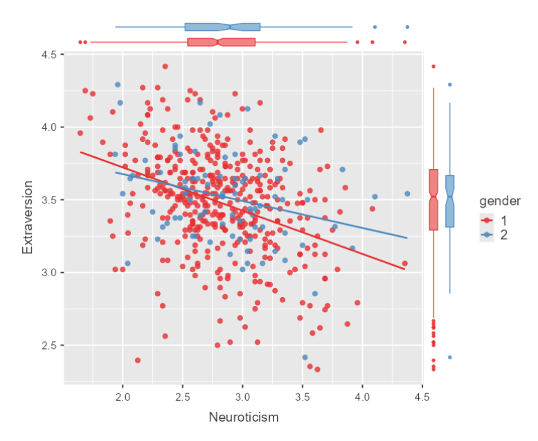
Note: There is a major drawback to using jamovi and JASP which is, in a nutshell, these are not very customizable. This is another good reason to use R!
However, we can customize somewhat if we are creative. For example, if we wanted to have the words "male" and "female" in the legend instead of "1" and "2", we can recode the variable as we learned before and use that variable.
❓ Your turn: Recreate the plot with a different legend for gender
- Transform the variable "gender" as follows: if source == 1 use "Female" else use "Male"
- Select the option 'density' and "smooth"
- Compare the two plots, what is different?
Using Flexplot
-
both JASP and jamovi have a module named Flexplot that can make a similar scatterplot
-
In jamovi, click Flexplot from the Analysis menu
-
Let's first recreate the plot above
-
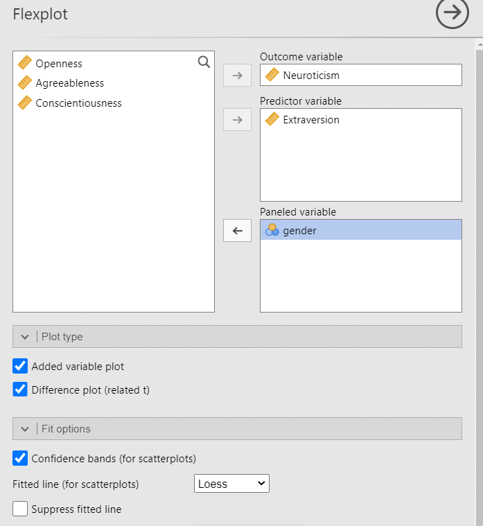
There is another cool option that facilitates visualization. It is called an Added Variable Plot.
- An added variable plot plots the effect of one variable on another with a third variable removed (i.e. controlled for). Let's see how this works
- First, lets look at Neuroticism and Extraversion
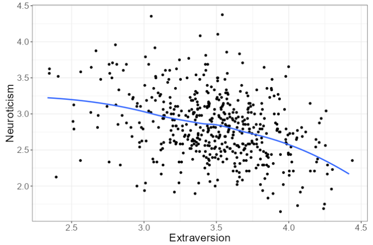
-
Now let's see the relationship after removing the effect of gender
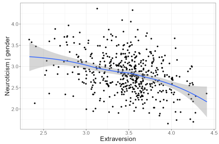
-
Notice the y-axis changed from Neuroticism to Neuroticism|Gender to reflect that gender is now being controlled for. The chart is basically the same, which suggests gender has little impact on this relationship. To recreate this chart, use the following specifications:
Correlation matrices
-
We make want to visualize the correlations between variables rather than report them (for example Table 2 above). The best correlation plot in jamovi is from the package jjstatsplot. (There are other ways to do this but they are clunky and as I said before you don't have much control over the output)
-
From the Analyses menu click 'jjstatsplot' and the Correlation Matrix. Put all the Big 5 variables into the dependent variable dialog box. Then to get the best visualization select the following options
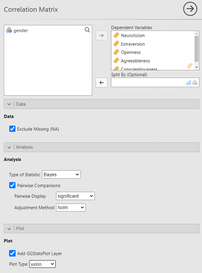
-
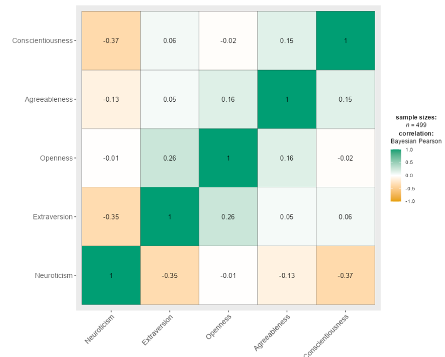
You should see the following correlation matrix
-
Which correlations are the strongest?
Box plots & violin plots
Dot charts
- Dot charts are best when there are multiple levels of the independent variable (for example, instead of Black v White, you would have race as Black, White, Asian, Native American, Hawaiian, etc.)
- See my example for creating a dot chart using the National Survey of Child Health
Alluvial diagrams
To demonstrate how to create an alluvial diagram, I am going to use data on Fatal police shootings collected by the Washington Post.
Age pyramids
- This is a specialized plot that is unique to age (but you can fool it into doing a variable other than age if you want)
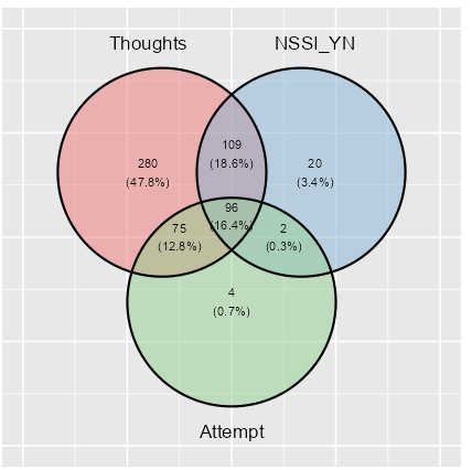
Venn Diagram
- This can be a powerful way to represent co-occurring symptoms or phenomena
- The data must be categorical
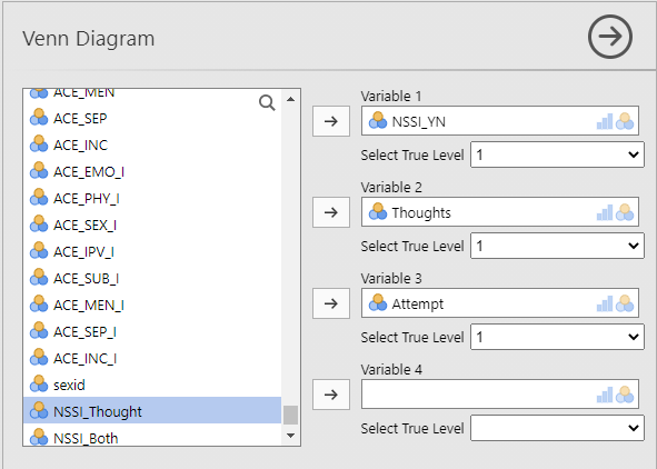
- I am going to illustrate how to make a Venn diagram using the TransPop survey data. We ask: how many respondents have NSSI, suicidal thoughts and suicidal behaviors
- From the Analyses menu select 'Exploration' and then 'Venn Diagram'
- Move the variables into the appropriate dialog boxes as shown below. Make sure you select 1 for True value level. The reason is because the data are coded as NSSI_YN = 1 if the respondent has non-suicidal self-injury and 0 otherwise. Same for thoughts and attempts. Therefore the "1" corresponds to the respondent endorsing that variable, and we want the overlap of all three, meaning the respondent said "Yes" to all three categories
- Here is the resulting plot
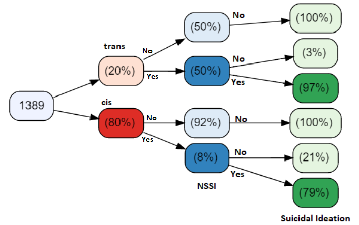
Variable tree plots
- The variable tree plot is similar, but slightly different. It represents the data in a tree format as the name suggests.
- I will illustrate this type of plot using the same data. Here we ask: what is the conditional probability that a respondent who identifies as (trans/cis), who has NSSI (Yes/No), will also endorse suicidal ideation?
- What is the probability that a trans person with NSSI has suicidal ideation?
- What about a cis person?
Interpreting data
- Telling a story with data
- The significance of insignificance
- Publishing an article using data you've analyzed in JASP or jamovi