🔑 Summary of Key Takeaways for Day 2
🎯 Learning Objectives for Day 2
- Learn how to clean in the most efficient way possible using existing software packages
- Learn how to use basic excel formulas to clean and format data quickly
- Learn how to recode, reshape and filter data in SPSS, jamovi and JASP
- Learn how to define and use new variables
- Learn how to merge different datasets using unique identifiers
📃 Summary of Notes
Day 2 Morning: Formatting, Cleaning & Reshaping Data
Data Formats
Structured Data
This is the most common data format. It is the format we are used to in EXCEL and SPSS, for example.
| Indicator ID | Snapshot Year | Region of Supervision | County of Residence | Supervision Level | Gender | Age | Crime | Race/Ethnicity |
|---|---|---|---|---|---|---|---|---|
| 2149980 | 2020 | HUDSON VALLEY | ALBANY | LEVEL 4 | FEMALE | 23 | LEGISLATIVE VFO | BLACK |
| 2149981 | 2020 | HUDSON VALLEY | ALBANY | LEVEL 3 | FEMALE | 26 | LEGISLATIVE VFO | BLACK |
| 2149982 | 2020 | HUDSON VALLEY | ALBANY | LEVEL 1 | FEMALE | 27 | MAJOR PROPERTY | WHITE |
| 2149983 | 2020 | HUDSON VALLEY | ALBANY | LEVEL 4 | FEMALE | 27 | OTHER COERCIVE | BLACK |
| 2149984 | 2020 | HUDSON VALLEY | ALBANY | LEVEL 3 | FEMALE | 29 | MAJOR PROPERTY | WHITE |
| 2149985 | 2020 | HUDSON VALLEY | ALBANY | LEVEL 3 | FEMALE | 29 | MAJOR PROPERTY | BLACK |
| 2149986 | 2020 | HUDSON VALLEY | ALBANY | LEVEL 4 | FEMALE | 29 | LEGISLATIVE VFO | BLACK |
| 2149987 | 2020 | HUDSON VALLEY | ALBANY | LEVEL 4 | FEMALE | 30 | LEGISLATIVE VFO | WHITE |
The data has clearly labeled variables and values associated with each variable. The values take the form of integer, decimal or text and can have one of four types of measures:
 Nominal (categorical)
 Ordinal (ranked)
 Continuous (interval/ratio or scales)
 ID (unique to jamovi, variable that is an identifier)
- It is easy to change the measurement type and it is often necessary to do so.
- Unlike SPSS, neither jamovi nor JASP will allow you to incorrectly analyze the data based on the variable type. For example, you cannot places a continuous variable in a crosstab because crosstabulations are based on categorical data types.
- In jamovi, to change the measurement of a variable, simply click on the icon next to the variable name.
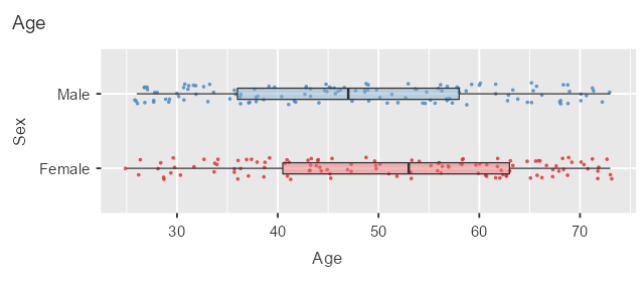
- The example below illustrates the profound difference that a change in the measurement type has for your analysis and visualizations.
❓ Your turn
- Open the jamovi file under Bootcamp/ex/Day 2/data management.omv
- Click on the Exploration tab and go to 'Survey Plots'
- Put the 'Age' variable in the 'variables' box and the 'Sex' variable in the 'Grouping Variable' box
- Change the measurement type for the variable 'Age' from continuous to ordinal (does that change make sense?)
- Your plot should look like this after playing around with the options.
Unstructured Data
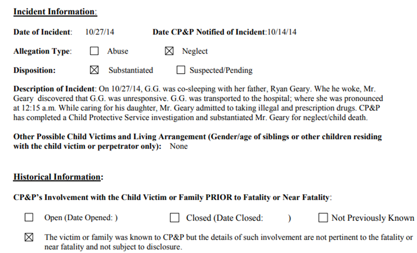
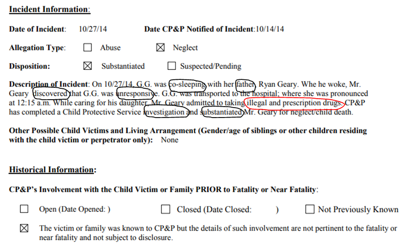
It’s relatively easy to give answers to well-specified questions using structured data sources and standard statistical analysis. When there is no structure to the data and the problem is not well-specified standard analyses don’t work. Unstructured data makes up 80-90% of all data produced by organizations (Holzinger, Stocker et al., 2013) including police reports, court documents and human service organizations. Social networking algorithms and text mining can help given meaning to narrative, unstructured text.
Consider the report death report from New Jersey).
According to the Comprehensive Child Abuse and Prevention Act, the Department of Children and Families is allowed to release data on child fatalities and near fatalities. These data are located here (DCF | Child Fatalities (nj.gov)).
The columns we tend to focus on are date of incident, allegation type, disposition while ignoring the most important aspects of the case, included in the case disposition as well as historical information.
Graph-based or Network Data
A graph is a mathematical structure to model pair-wise relationships between objects. Graph or network data is useful for representing highly interconnected data.
The graph structures use nodes, edges, and properties to represent and store graphical data as the next example will illustrate. The node is the entity itself, such as people in a social network. The edge represents the relationship between two entities.
The properties are attributes that can come from structured or unstructured data sets.
**Graph-based data is a natural way to represent social networks. The structure allows you to calculate specific metrics such as the influence of a person and the shortest path between two people.
| ID | Name | Sentence |
|---|---|---|
| 0 | Jose | Murder |
| 1 | Mark | Drugs |
| 2 | Jerome | Drugs |
| 3 | Luke | Murder |
| 4 | Darrell | Murder |
| 5 | Cam | Drugs |
| 6 | Burns | Drugs |
| 7 | Lee | Other |
| 8 | Bob | Other |
| 9 | Owen | Drugs |
| Source | Target | Interactions |
|---|---|---|
| Darrell | Jose | 17 |
| Luke | Jose | 13 |
| Jabba | Jose | 6 |
| Darrell | Mark | 5 |
| Han | Jerome | 5 |
| Darrell | Luke | 3 |
| Don | Darrell | 1 |
| Burns | Cam | 7 |
| Darrell | Burns | 5 |
| Darrell | Lee | 16 |

| An Overview of Common Errors | |
|---|---|
| Errors pointing to false values within one data set | |
| Error Description | Possible Solution |
| Mistakes during data entry | Manual overrules |
| Redundant white space | Use string functions/Excel find and replace |
| Impossible values | Manual overrules |
| Missing values | Remove observation or value |
| Outliers | Validate and, if erroneous, treat as missing value, report both with and w/out outlier |
| Errors pointing to inconsistencies between data sets | |
| Deviations from code book | Match on keys or else use manual overrules |
| Different units of measurement | Recalculate |
| Different levels of aggregation | Bring to same level of measurement by aggregation or extrapolation |
Common Errors Encountered with Publicly Available data
False Value errors
Strange Characters
Data Cleaning and Formatting in EXCEL
EXCEL offers some useful ways to explore your data prior to conducting any analysis. Here are some of the most important EXCEL functions IMHO:
- Creating pivot tables: allows you to aggregate data that is not in a proper format for analysis
- Working with dates and times
- Searching and replacing data
- Creating charts including time series charts and heatmaps
- Filtering texts
We are going to learn how to do all of these tasks now.
PIVOT tables
❓ Your turn: Creating Pivot Tables in Excel
- Open the Hospice Referral data Bootcamp/ex/hospice/hospice_demographics_18_21_dataset_dec_2022.xlsx we downloaded yesterday.
- Take a look at how it is structured
- Note: a lot of data comes formatted in this way, and it is difficult to know what to do with it. For another example see CDC's Places dataset
- If you want to see my R code for automating this process by downloading the data directly from the website, reshaping and filtering the data, merging the data to the National Walkability index, and then mapping the data, see Analyzing Places Data
- In the excel file, I created a series of tabs each of which has a different pivot table. Look over each tab.
Pivot Tables
- Let's revisit how to create a pivot tables using Excel. Yesterday, we looked at hospice data from California. The data is here
- Watch my steps, recreate each pivot table in the Excel spreadsheet.
- For example, the table 'Referral Type by Payee' should look like this:
| Payee | Facility | Home | Total |
|---|---|---|---|
| All Other | 894 | 1963 | 2857 |
| Medi-Cal | 5836 | 15714 | 21550 |
| Medicare | 33839 | 125253 | 159092 |
| Private | 4222 | 15994 | 20216 |
| Self-Pay | 200 | 657 | 857 |
| Grand Total | 44991 | 159581 | 204572 |
❓ Your turn: Making Pivot Tables
-
Make a pivot table of social vulnerability by counties in Ohio.
-
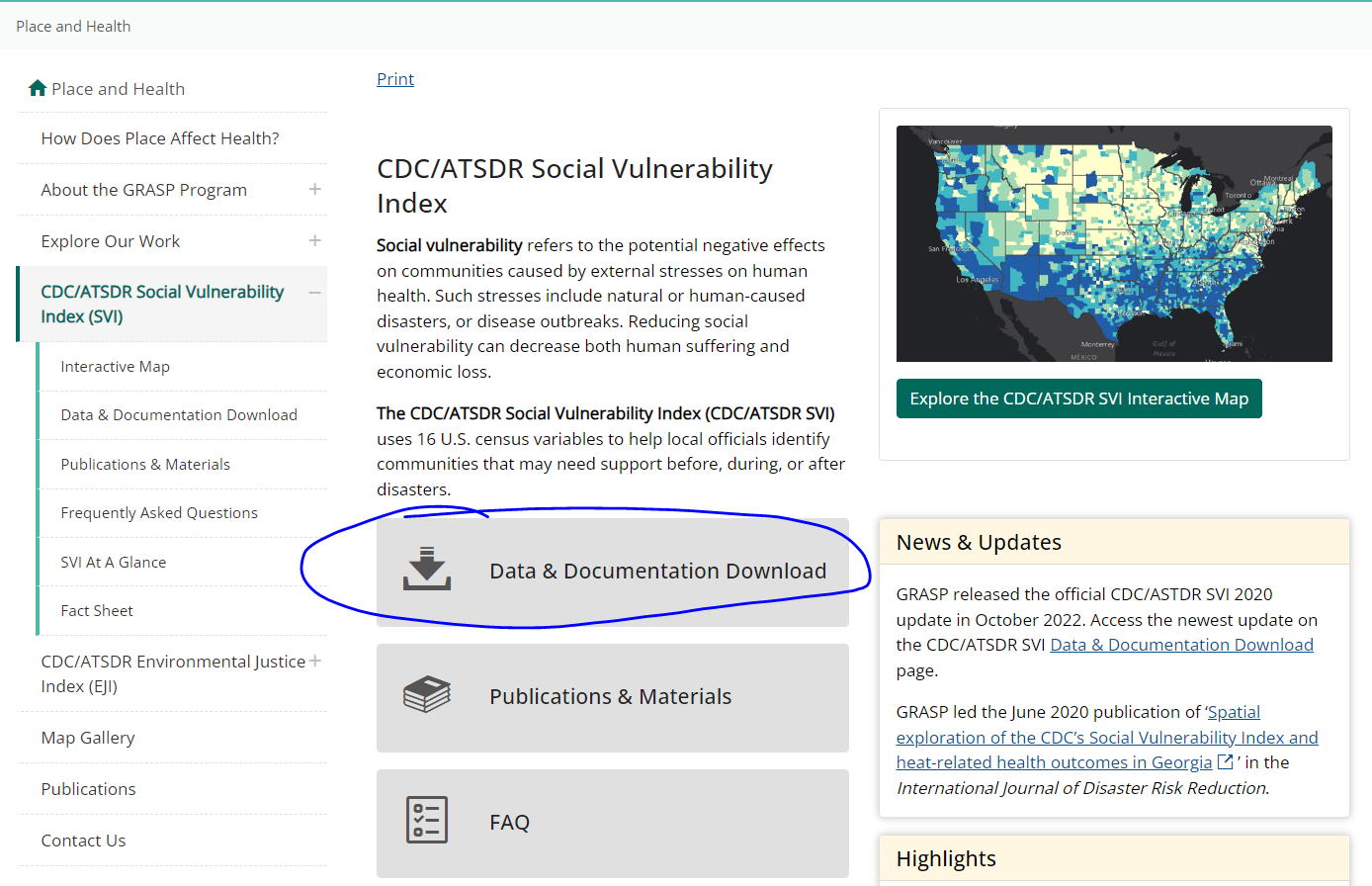
Navigate to CDC/ATSDR Social Vulnerability Index (SVI) I used these data for this paper Examining Spatial Regimes of Child Maltreatment Allegations in a Social Vulnerability Framework (sagepub.com)
-
Click Data and Documentation
-
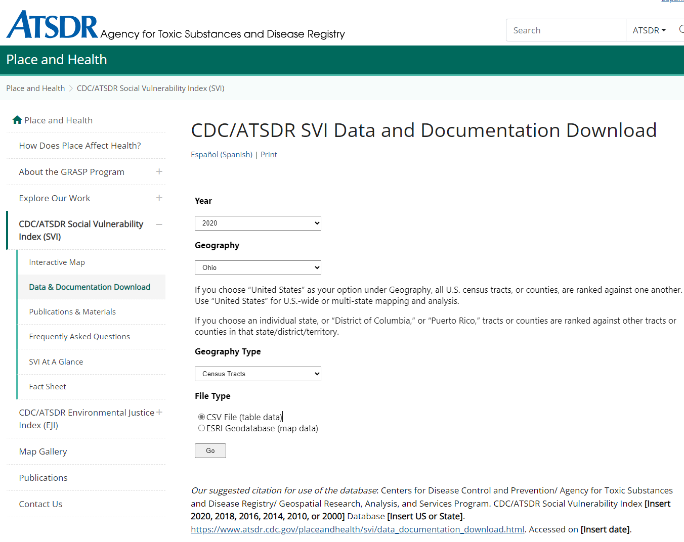
Enter the following specifications
-
Go to the documentation for 2020 and read through it
- Describe the four social vulnerability indices
- Create a pivot table of the socioeconomic vulnerability theme by county
Working with Dates & Times in Excel
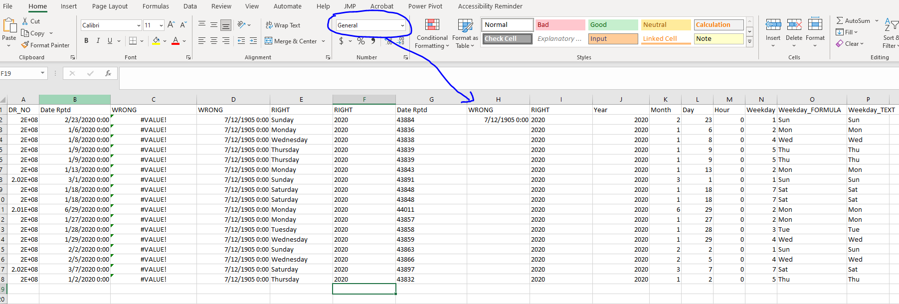
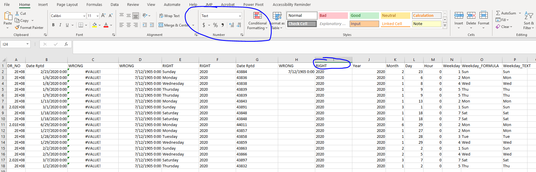
Unless you want to use a programming package, like R, the excel date/time functions are great. As you will see below, I can make multiple different variables out of one date/time column. Unfortunately, however, Excel understands dates as serial numbers only! This can be a real pain. Below I show you how to use the date and time functions to properly create the following columns: day of week, week number, month, day (numeric) and year. Once the data are formatted in this way, we can make nice visualizations using pivot tables including time series charts and heatmaps!
Here are the steps you need to know:
Highlight date column
Right Click and select "Format cells" and the choose "Text"
You should see the date format change to a serial format, i.e. a number
We use the serial date format to further parse the dates
In the new column type =DATEVALUE(and the column you just inserted, example =DATEVALUE(C2)
= Year(Column), = Month(Column), = Day(Column)
= WEEKDAY(Column)
Default is “1” which returns from Sunday through Saturday
To return the actual day name type = TEXT(COLUMN, "dddd")
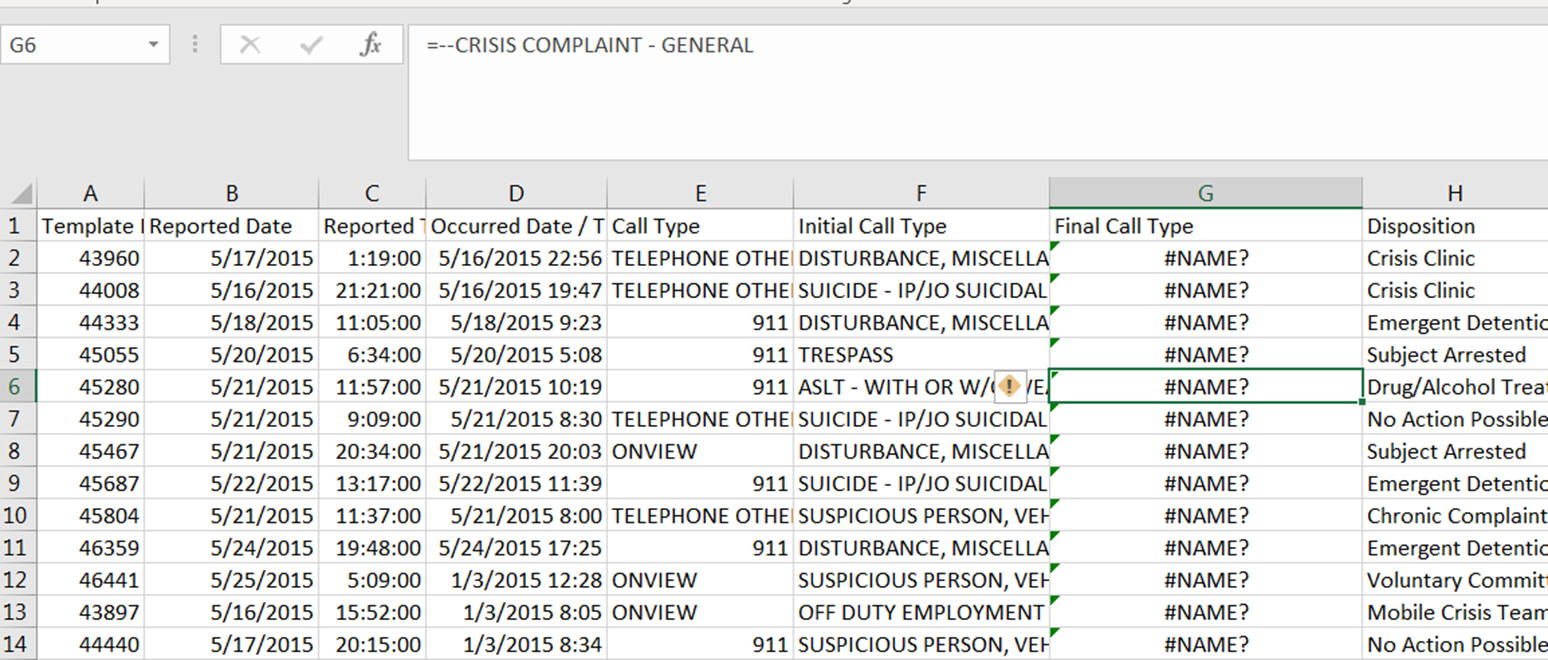
Open the file dates and times.csv I am going to go through it. Each column after the 'Date Rptd' has a formula, some of which are correct and some of which are not ...
❓ Your turn: Working with Dates and Times
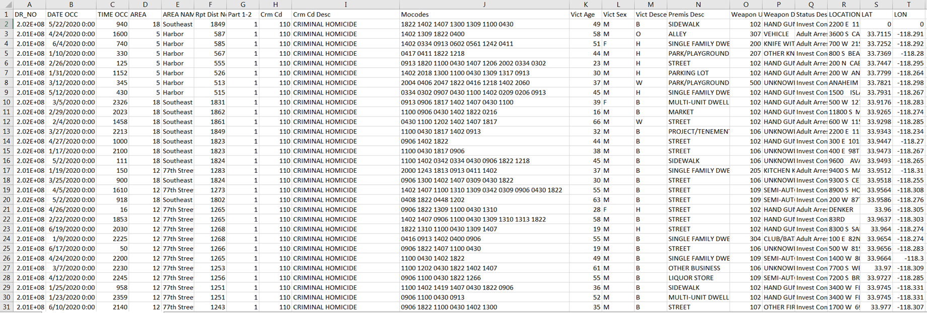
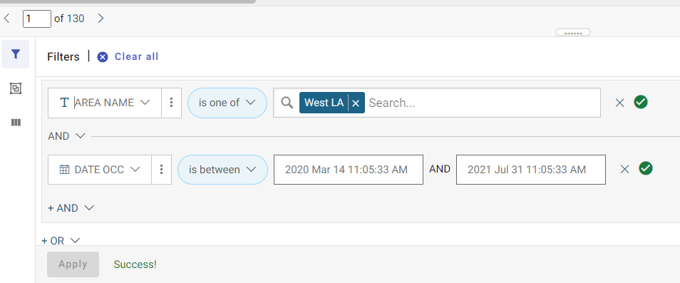
- Go to https://data.lacity.org/ and locate the crime data for 2020 onward.
- Filter the data by clicking on the three vertical dots and filtering the area = "West LA" and the Date OCC is between March 14 - July 31 2020 (roughly Phase I of the COVID-19 pandemic).
- Click on the Export button and leave the default as .csv. Open the file you just downloaded in Excel and make sure that the filters worked.
The data are located in Bootcamp/ex/dates_times/Crime_Data_from_2020_to_Present.csv
- We are going to use the date that the crime occurred as our date field (DATE OCC)
- Highlight the column and right click --> Format Cells --> select "Text" and click "OK"
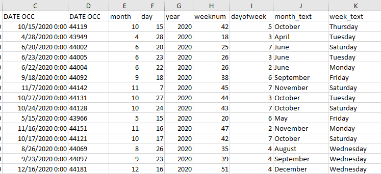
- Now we can use the date functions to get several additional columns from the date field such as month, year, day, day of week, week number, etc.
- After doing so, you should have something that looks like below:
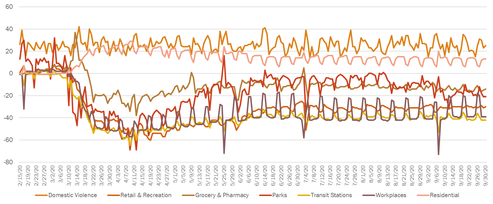
Here is how I used these data previously. I created the following chart using the google mobility indices and the data from above to demonstrate the association between domestic violence during the pandemic and mobility patterns during the initial phases of COVID-19. You now have access to all of this data, and can create a similar chart using Excel!
Day 2 Afternoon: Data Wrangling (The boring stuff that you have to know!)
Importing data
- Data often come in formats other than the default format that your statistical package uses.
- Therefore, it is important to know how import different data formats into your package. We will learn how to import csv, xlsx, sas, stata and txt files into both SPSS and jamovi.
- Navigate to the folder Bootcamp/ex/ImportData.omv
Computing variables
- I am going to illustrate how to do the following
- Compute means across rows
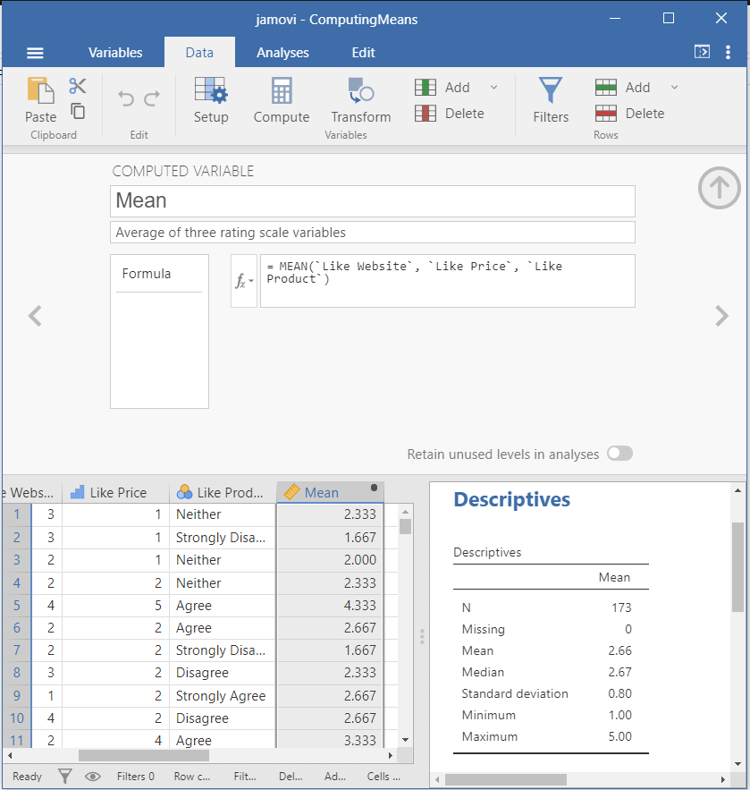
❓ Your turn: Compute standard deviation across rows
- Use the file ComputingMeans.omv
- Compute the descriptive statistics for the new variable
- Open the file ComputingZScores.omv and notice how the Z-scores for the mean were computed
- Now do this using SPSS
Reshaping data
Filtering data
- jamovi offers several advantages for filtering data. In jamovi, you can create multiple filters for the dataset. To activate the filter you simply click the activate slider next to the filter you created.
- Open the file FilteringCases.omv
- To create a filter for a variable, click on "Data" and then press the button to add filter or press "Filters"
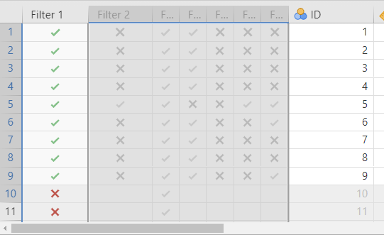
- There are multiple filters set up in this file, Filter 1 selects all rows where the unique ID column is less than 10, while Filter 2 selects all cases where the mean is greater than 4
- You will notice that the filters are inactive, click the inactive button to make Filter 1 active
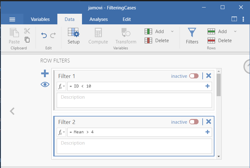
- You will see that Filter 1 is now active and the color changed to green. Also note that all cases where ID < 10 are now selected and ready to be analyzed.
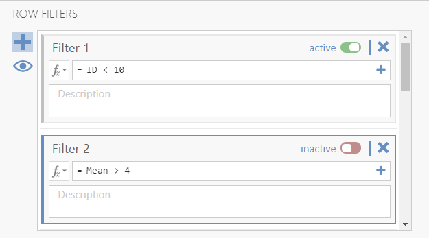
- Once the filter is active, all cases that have a green check mark correspond to rows that satisfy the filter condition (i.e., here ID < 10). All other rows have a red X
❓ Your turn: Select and Create New Filters
- Use the file FilteringCases.omv
- Keep Filter 1 activated and activate Filter 2. Describe what the filter is when both filters are activated.
- Create a filter that selects all cases where the mean is > 2 (Type Mean > 2, jamovia is case-sensitive).
- Activate Filters 1 and 2 and the filter you just created. How many cases of the dataset satisfy all three conditions?
- Delete the filter you created.
Recoding data
- jamovi makes it easy to recode data. One reason is because the software allows you to set up a coding 'schema,' save it, and apply it to multiple columns.
- Let's recode the Z-score from above into a variable that indicates whether the Z-score is 'extreme' or not. We define 'extreme' as being more than two standard deviations from the mean
- The logic then is:
if(the Z-score is greater than 2) then it is extreme --> "Yes"
else if (the Z-score is less than -2) then it is extreme --> "Yes"
else it is not extreme --> "No"
Adding observations from one table to another table
- from jamovi, click Data and then Transform --> Create New Transform
❓ Your turn: Recoding variables
- Use the file ==TransformingScoresToCategories.omv ==
- Create a transformation that codes values of the mean that are greater than 1 using the following coding scheme if > 1 then "Greater than 1" else "Less than or equal 1"
- Use the Descriptives tab to calculate the percentage of cases that have mean scores greater than 1
- Apply the transformation you just created to the Z-score variable
- Edit the transformation by changing 1.8 to 1.6. What do you notice after you apply the transformation?
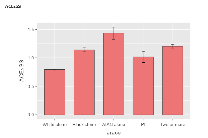
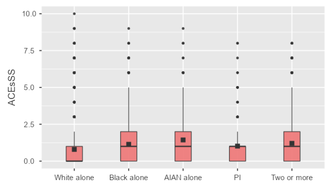
❓ Your turn: Apply these methods to a real dataset
- We are going to use the National Survey of Child Health Data to compute an ACEs cumulative risk score by race of child. One benefit of these data is that the data are not based on retrospective report. Another nice thing about the data is the addition of other ACEs not typically measured in previous studies.
- Let's familiarize ourselves with the data and look at the codebook and variables.
- I subsetted the data for you and the file is called Bootcamp/ex/WranglingData/NSCH_2021_sub_wrangling_Ex
- First transform the ACE3 variable as follows 1 = "Yes" and 0 = "No." This step is necessary because we need to sum the scores to get the cumulative risk score.
- Then, apply the transformation to the other ACEs 4-12
- Finally, use the compute function to sum the newly transformed ACE3-ACE12 variables. Call the new variable ACEsSS.
- There were not enough cases for "Asian alone" so I coded them as missing
- Go to the Exploration tab and choose Descriptives. Make sure you choose the selections as I have them below.
You should have something that looks like this

Next, under plots, choose the following selections

And you should have the following images.
Recoding & Defining variables
- To learn this, we will explore associations between TBI (traumatic brain injury) and ACEs (Adverse Childhood Experiences) using the National Survey of Child Health.
- The data are downloaded already for you NSCH_2021.sav (you need to download the zip file but first try to download it from the website)
Merging data:
- Allows you to combine the information of one observation found in one table with the information that you find in another table
- Appending or stacking (adding rows)- Joining (adding columns)
- Examples
- One table may contain demographic data and another table may contain data on sentences
- One table may contain data on network nodes and another table may contain data on network edges
- To join tables, you use variables that represent the same object in both tables, such as a date, a country name, or a Social Security number
- We are going to use the Add Health data to demonstrate how to merge data
![![[Pasted image 20230802112345.png]]](#![[Pasted_image_20230802112345.png]])