Exploring data from the Washington Post: what do we know about police shootings?
Introduction to the dataset
The website that is based on these data is located here. Let's take a look at it: https://www.washingtonpost.com/graphics/investigations/police-shootings-database/
- According to the website how many people have been shot and killed by police in the past year
- How does this compare the the previous year?
- Which racial group was most likely to be shot by police?
- Black people account for 13% of the population but killed by police at more than twice the rate of Whites
- But, what about other states where Black people make up more or less of the population, what is the rate in those states, cities, towns?
- Each circle on the maps represents a deadly shooting (later)
- Can we identify blocks that are hot spots?
- The Washington Post has a github site where they store the data. Download the data here
- Click the green code button and then "Download ZIP"
- Open the data in Excel
- Look at the columns, they are fairly straight forward
- Import the data into jamovi or open the file Bootcamp/ex/police shooting/alluvial-race-MI-flee.omv.
- The file contains several visualizations and basic descriptive statistics in that file for us to review.
Visualizing the data using jjstatsplot
The first visualization is from jjstatsplot. It shows the box plots of average age across 6 states. The package also plots the significance of the visualization so that it is more informative. The lines represent whether the mean ages are statistically significant across states. You can format this plot in a couple of different ways to facilitate interpretaion.
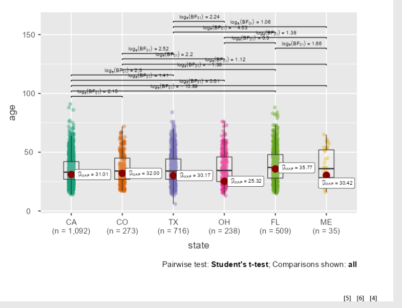
Fig 2. You can make this in jamovi by simply filtering the states to show the ones you want, and then using the plot function in the Exploration tab (Grouping by state)
Visualizing the data using an alluvial plot
-
Let's create another cool visualization by representing some of the data as a flow diagram.
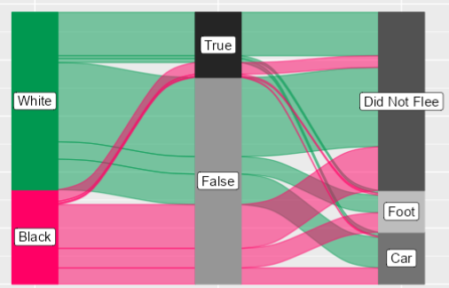
Fig 3. This type of plot is a representation of a network plot called an alluvial plot also called a Sankey diagram. -
The first "flow" represents the race of the victim.
-
The next flow is whether the victim was mentally ill or not.
-
Finally, the last flow shows whether the person fled by foot, car or did not flee.
❓ Your turn: Advanced Charting
- Look at my specifications for each chart
- Create a new analysis and remake my charts above