🔑 Summary of Key Takeaways for this Example
- Learn about the Urban Institute's Data Portal including the Education Data Portal
- Create and download data from the Education Portal
- Overview of making charts using Excel and JASP
- Exploring JASP functionality including filtering and linking data sheets
The Urban Institute's Education Portal
About the data portal
From their website: The Education Data Explorer is the online download tool of the Education Data Portal. This initiative of the Urban Institute’s Center on Education Data and Policy draws on data from most major national data sources on schools, districts, and colleges, harmonizing variables and documentation to make it easier to look at trends and combine data. We hope this site will empower researchers, practitioners, and policymakers to generate rigorous, accurate, and actionable insights to improve student outcomes.
Data Sources
The portal draws on a number of excellent data sources related to education and academic achievement, including:
- Common Core of Data
- Small Area Income and Poverty Estimates
- The Civil Rights Data Collection
- EDFacts
- Integrated Postsecondary Education Data System
- College Scorecard
- National Historical Geographic Information System
- Federal Student Aid
- National Association of College and University Business Officers
- National Center for Charitable Statistics
- Model Estimates of Poverty in Schools (MEPS)
You should check out these various datasets at your convenience. I have used the Civil Rights Data Collection to analyze student discipline by race/ethnicity. Read my analysis on school discipline by race here.
Downloading & Analyzing Data from the Education Portal
Downloading data
We are going to use the Education Data Explorer to create a subset of data that we can analyze and map!
-
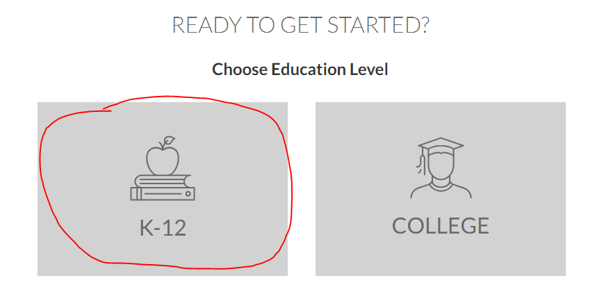
Click the 'Get Started' button to begin

-
Click on K-12
-
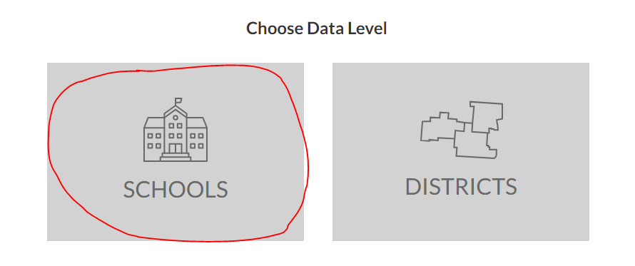
Click Schools
-
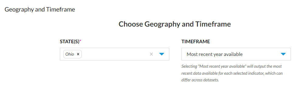
Select Ohio & leave the timeframe as it is
-
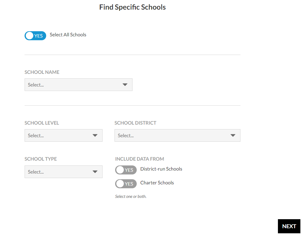
Make sure the tab by "All Schools" says "Yes", click "Next"
-
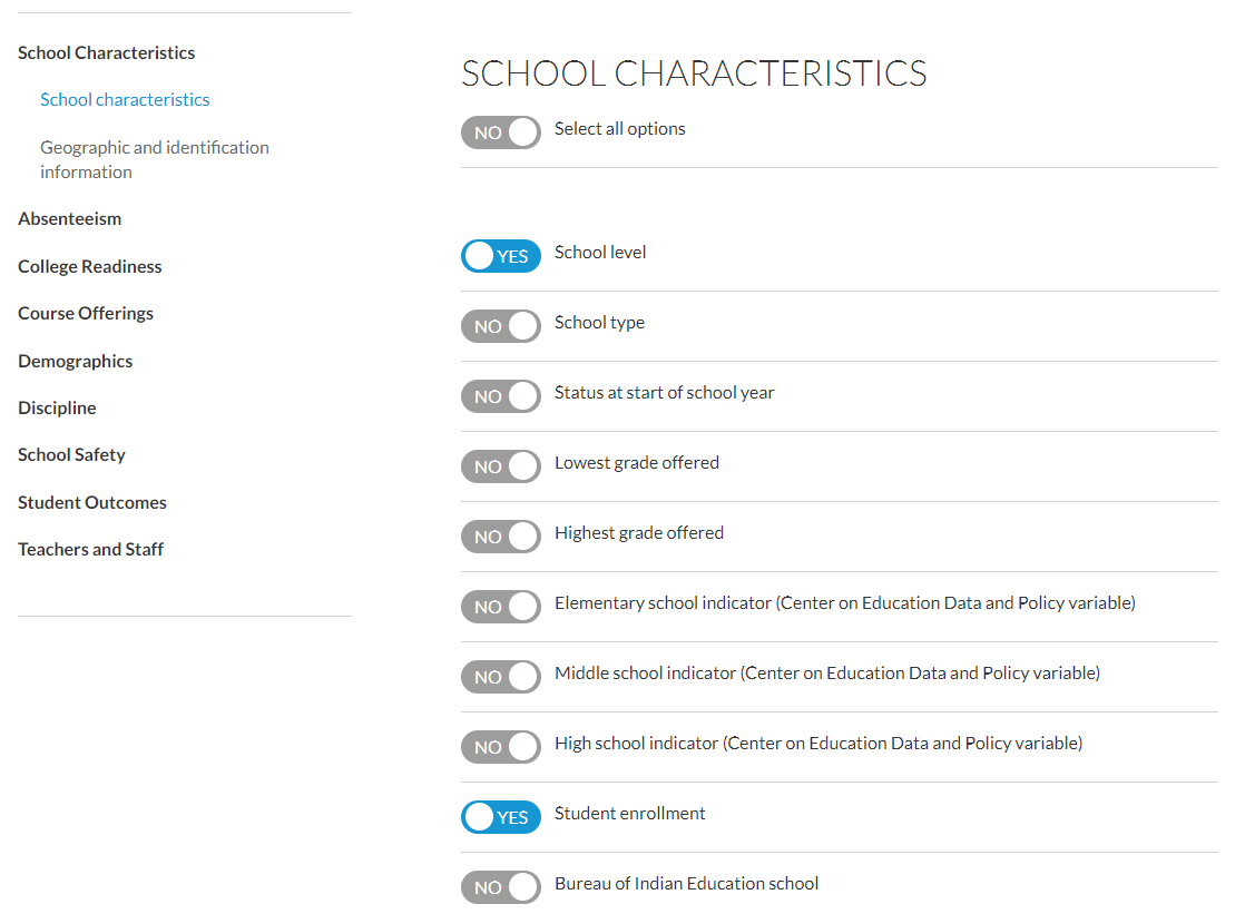
Under School Characteristics select "School level" & "Enrollment" (do NOT click "Next" yet)
-
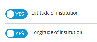
Click "Geographic and identification information" and select latitude and longitude of the institution
-
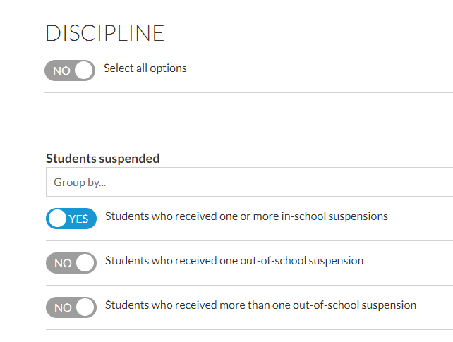
Click Discipline and select 'Students who received one or more in-school suspensions"
-
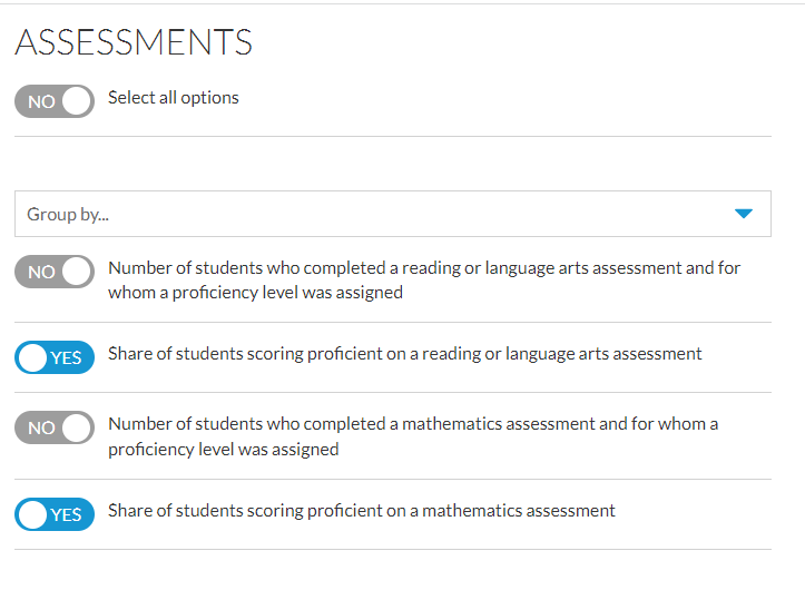
Click Assessments and then 'Share of students scoring proficient on a reading or language arts assessment' and math
-
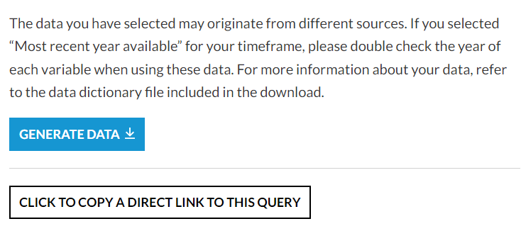
Click "Next" and review the query. If it looks OK click on the "Generate Data" button
-
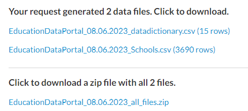
After a couple of minutes you will see links to the data appear on the webpage
-
Click on the zip file link to download the data. The zip file contains the data dictionary and the data we will analyze.
Analyzing Data
- Unzip the file you just downloaded
- Open the data dictionary
- Open the data in Excel
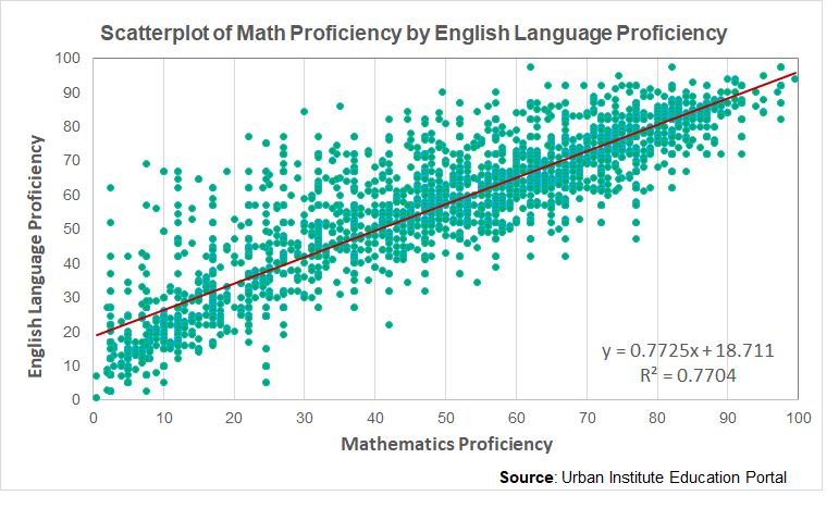
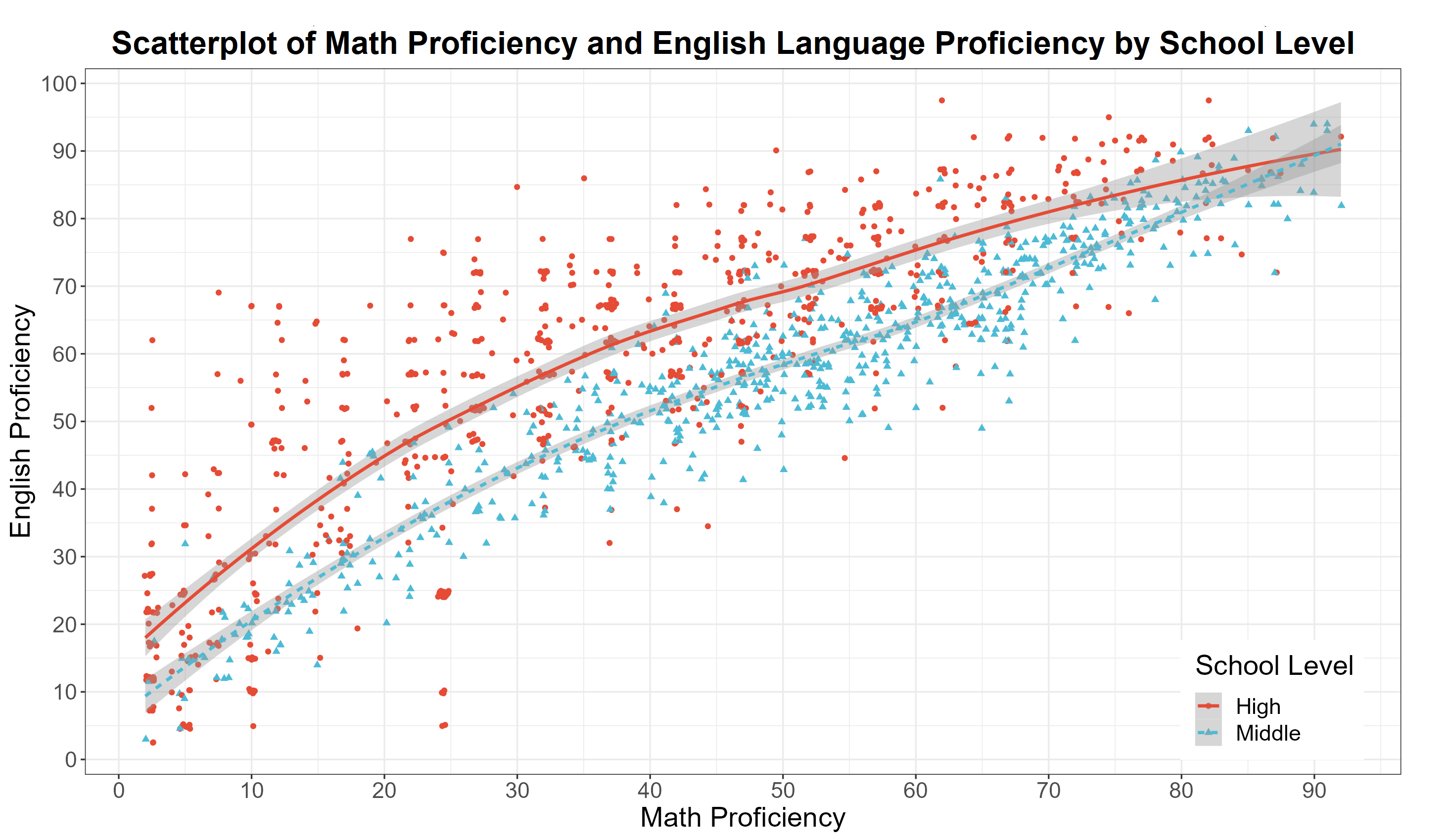
- We are going to make a scatterplot of math achievement by English language achievement using Excel
- We need to clean up the data before making the chart
- See if you can identify what needs to be addressed before attempting to analyze the data
- Then we will open the file in JASP and make a scatterplot of math achievement by English language achievement by school type
- You should have the following plots at the end of this
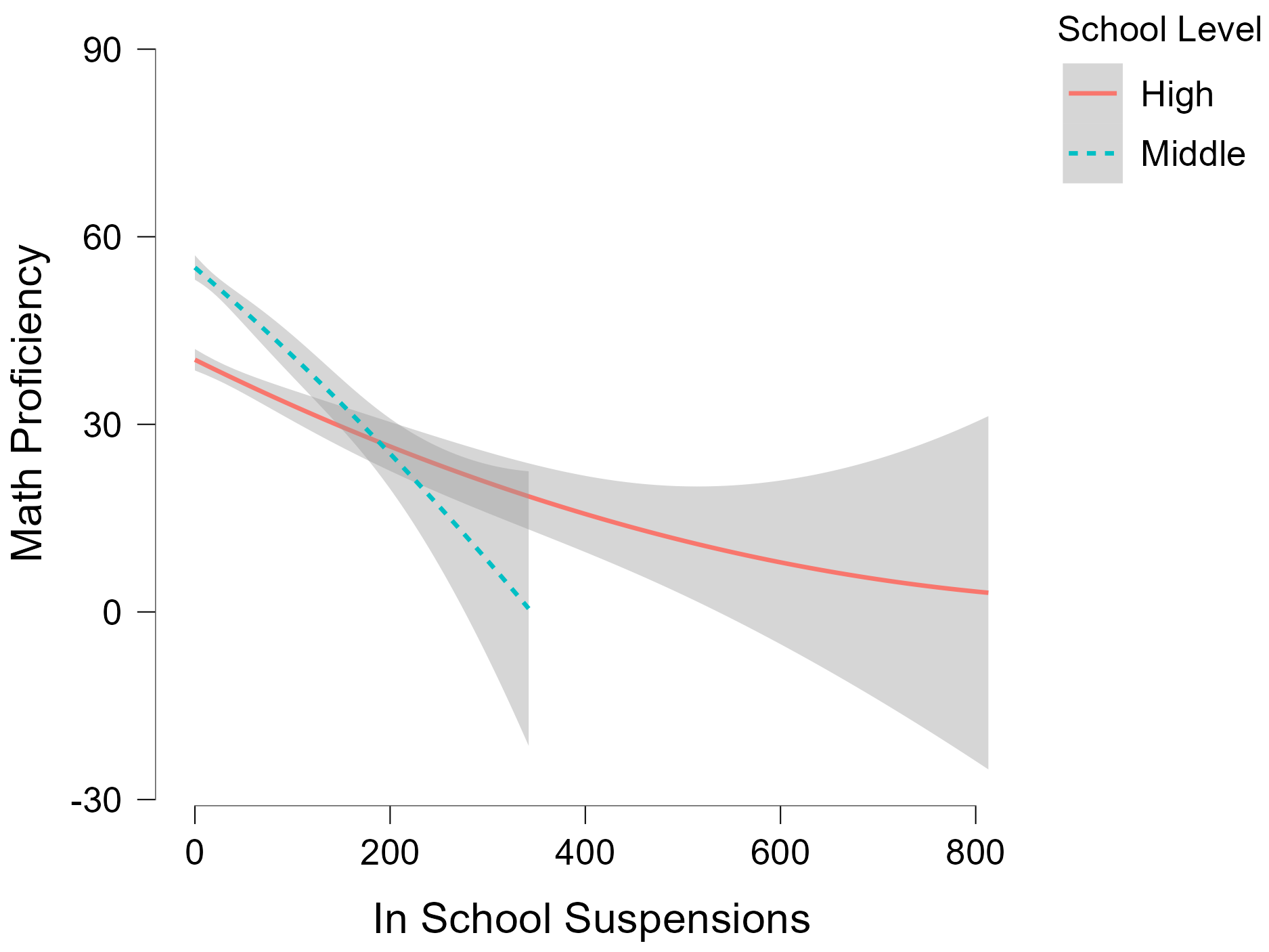
- In JASP, I can make a nice plot that conditions the relationship by school level. Open the JASP file called EducationDataPortal_08.06.2023_Schools.jasp to see how I made this scatterplot. We will learn more about this during Day 2.
❓ Your turn
- In the JASP file click on the tab titled "In School Suspensions and Math Achievement"
- Compare and contrast the plot below with the scatterplot of English language and Math proficiency above. What do you observe?